Help Center
Getting Started
Core Features
Payments & Analytics
Settings
Team & Scheduling
Integrations
White-Label
Bookings & Customers
Setup
Booking Widget Settings
Every card on the Settings tab of Widget Setup, what it changes, and which settings are per widget.
Open Widget Setup from the Setup section of the sidebar and stay on the Settings tab. This article goes through its cards in the order they appear. Widget types and the Design tab are covered in Widget Setup, and the code for your website in Widget & Embedding.
Which widget am I editing?
The page title is the widget you are editing. Click it to switch to another widget, add one, or open a widget’s options. The Primary widget is the one your website, booking page and plain links use; the others are used only by links and embeds that name them.
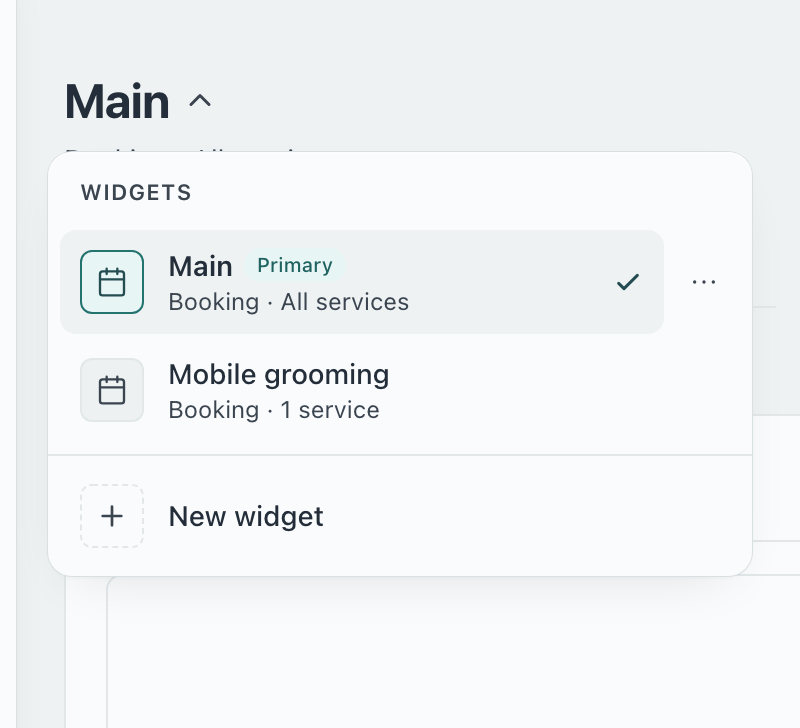
New widget adds one, up to your plan’s limit. It starts with the standard settings below, except that a phone number is asked for but not required.
Options on a widget: Rename, Copy link, Make primary (your website and booking page switch to it), Duplicate (a copy with a new link) and Delete. Renaming gives the widget a new link; the old link keeps working.
The subtitle under the name, such as “Booking · 3 services”, is a quick check that you are on the right widget.
Basics
Description
A short greeting shown above the services. Use it to say who you are and what to pick. Up to 2,000 characters.
Widget type
Booking (customers pick a date and time), Order (customers order and pay online, no time slot) or Quote Only (customers see a custom quote). The type decides which cards appear below: Order and Quote Only widgets have no First step, Booking confirmation, Team or Time slot interval cards. See Widget Setup.
First step
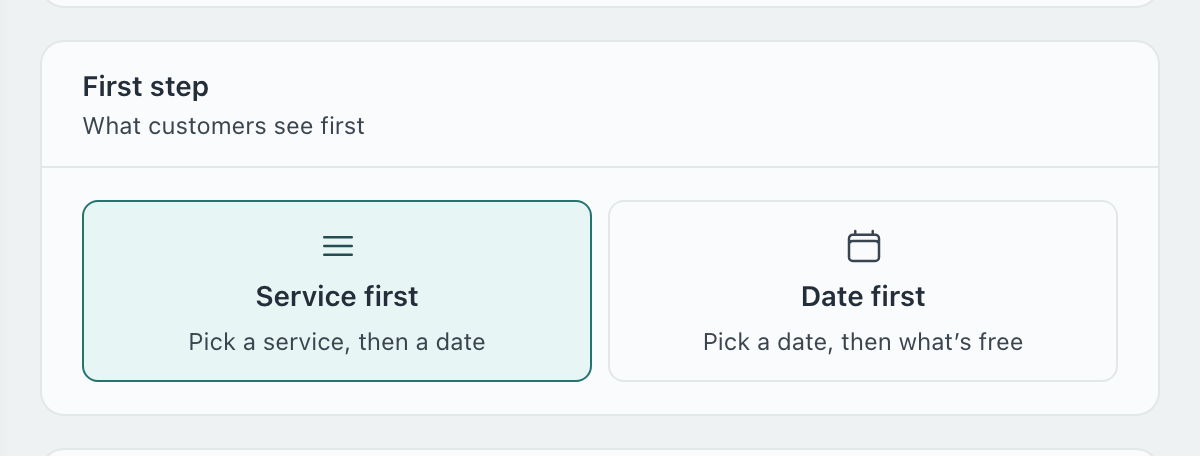
Service first shows your services, then the calendar. Date first shows the calendar, then what is free that day: a good fit when customers care more about the day than the service. The card tells you if a service needs no date, or if a team member’s free time is checked after the day is picked.
Services
All services is the default. Pick some to make a widget for one part of your business, such as a page that sells only grooming. The Manage services link opens Services & Pricing. A service sold only on a secondary widget still shows on your website unless you hide it there.
Checkout
Collect payment
Switch it on to take payment when the customer books. It needs a connected Stripe account; until then the card says Stripe needed and customers book without paying. Set it up in Payments.
Deposit is a percentage of the price. 0% charges nothing at booking, 100% takes full payment up front, and anything between takes that much now and the rest after the service. The balance is charged, sent as a payment link or recorded by hand, as set in Booking Policies.
Subscriptions appears when the widget sells a recurring service: charge the first session in full, or take the deposit now and the balance when the first session is completed. Later sessions are charged when they complete.
This card is hidden on Quote Only widgets.
Booking confirmation
Auto confirms every booking at once. Manual holds each one as a request until you confirm it from Bookings. Bookings that pay a deposit are confirmed automatically, so the choice disappears when a deposit is on.
Team
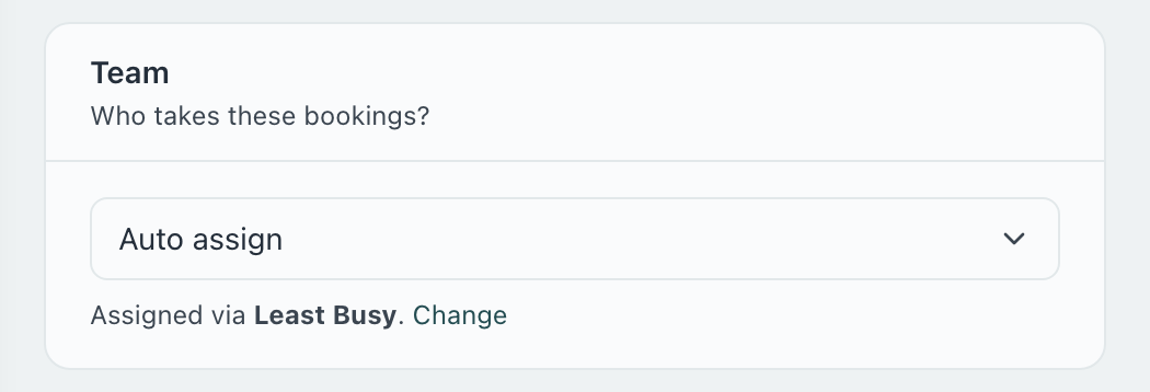
Shown once you have two or more team members. Auto assign picks from whoever is free and qualified, using the assignment mode from Settings → Team (Least Busy, Round Robin, Priority or Manual). Must choose makes the customer pick a person; Optional lets them pick or skip. Under Always this person, pin one team member: every booking from this widget goes to them, as long as they are free at the chosen time. See Auto-assignment.
Default location
Shown once you have two or more locations. Show location picker asks the customer which one; or pin the widget to a location, for a page about that branch. The pinned location also decides the county or region the address card can prefill. See Multiple Locations.
Booking form
Time slot interval
Every 15, 30 or 60 minutes: how often start times are offered. This one setting is shared by every widget. It only applies to Booking widgets whose services have a duration.
Customer info fields
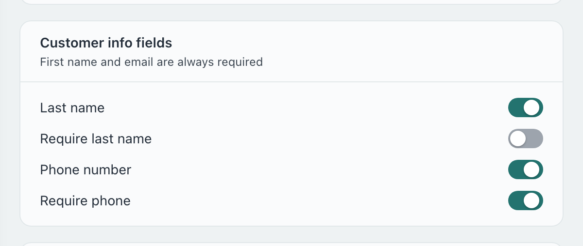
First name and email are always asked for. Choose whether to ask for a Last name and a Phone number, and whether each is required. Fewer required boxes means more completed bookings; a required phone number means you can always reach the customer on the day.
Booking instructions
Text shown on the booking form: parking, what to bring, how to find you. Up to 2,000 characters.
Photo & file upload step
Adds a step where customers attach photos or files before booking, useful for quotes on work you have not seen. Set the Step title, a Description and Max files (1 to 10). Files count towards your storage.
Collect customer address
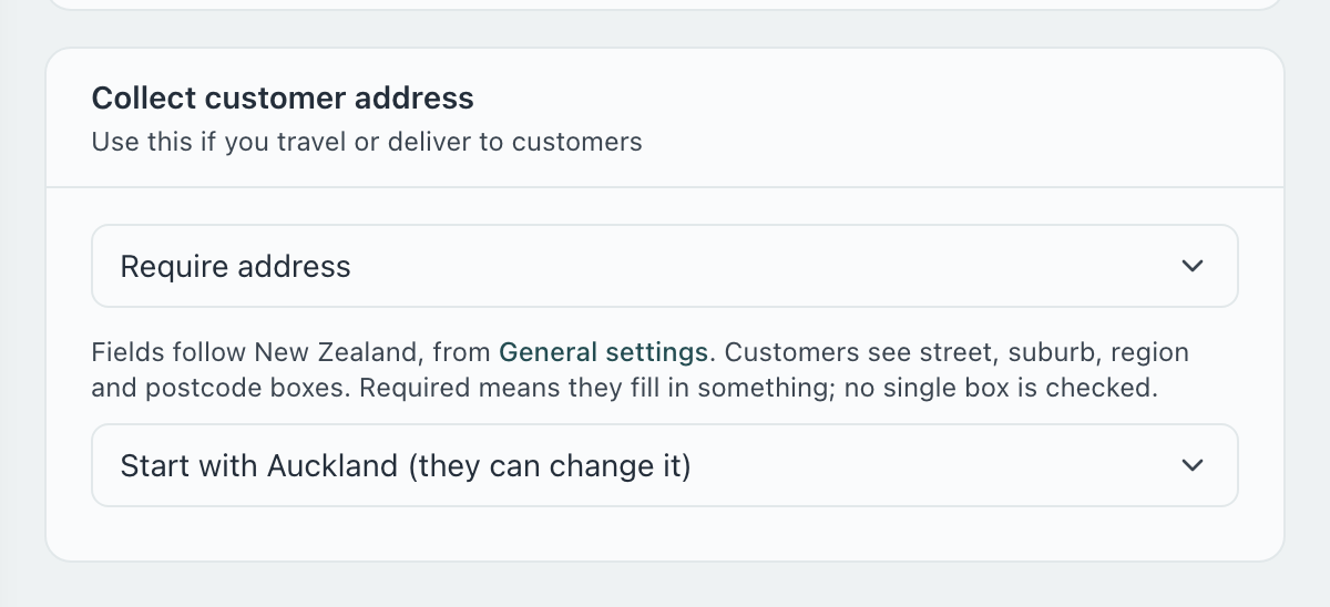
For businesses that go to the customer. Do not ask for address is the default. Ask for address (optional) adds the address boxes and lets customers skip them. Require address means the customer has to fill in something; no single box is checked, because it is their address and no form can validate every country’s.
The boxes are Street address, Unit / apartment, town or city, county or state where the country uses one, and postcode. Their names follow your country in Settings → General: County and Eircode in Ireland, State and ZIP code in the US. Every box starts empty, with no example text.
There is no country box. The visit is where you work, so your country is saved with the address.
County, state or region: once your location has one, choose Customer types their county (the box starts empty), Start with Dublin (they can change it), or Only Dublin, which locks the box and refuses a booking anywhere else, telling the customer “We visit Dublin only.” The name comes from the widget’s location.
The address is saved on the booking and on the customer’s record, so it is there for the next visit.
Appearance
Header and layout
Show logo in widget header is per widget and needs a logo in Settings → General. Header Layout (Stacked or Inline, Left or Center) is part of the design, so changing it here changes every widget.
Booking link
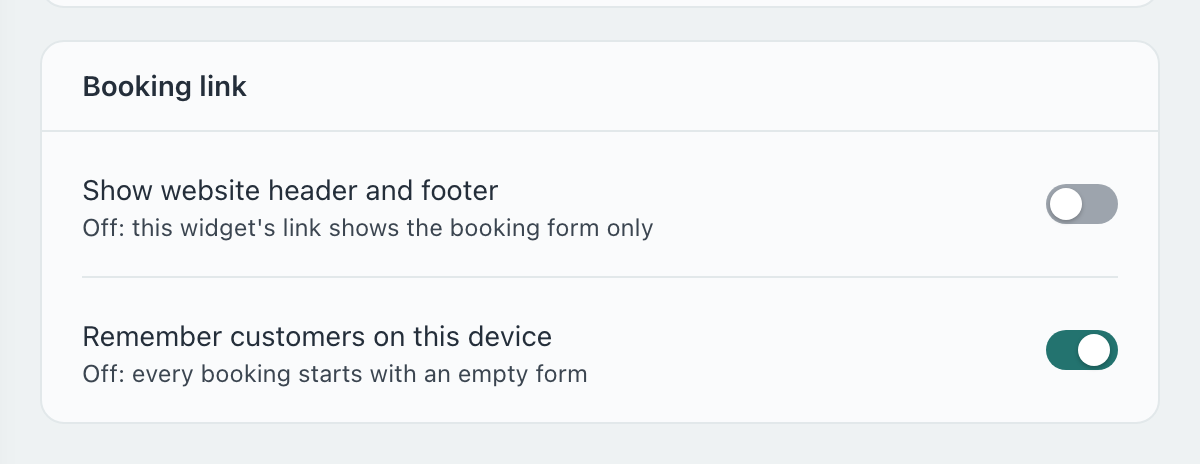
Show website header and footer (secondary widgets only). Off, the widget’s link shows the booking form on its own, for a landing page or a link you send by text.
Remember customers on this device. On, a returning customer’s details are filled in on the same device. Off, every booking starts with an empty form, which suits a shared tablet at the counter.
Policies
Agreements & policies
Tick the policies this widget shows. A document that needs acceptance adds an “I agree” box before booking, Required or Optional. Quote Only widgets ask for no agreements. Write them in Agreements & Policies.
Discount vouchers
Show voucher field adds a code box to checkout. Turn it off on a widget where you never want a discount applied, such as a corporate page. Codes are made in Vouchers.
Shared by every widget
| Setting | Where it lives |
|---|---|
| Design and theme, including Header Layout | Widget Setup → Design |
| Time slot interval | Widget Setup → Settings (one value for all widgets) |
| Country, which names the address fields and the phone example | Settings → General |
| Assignment mode (Least Busy, Round Robin, Priority, Manual) | Settings → Team |
| Hours, holidays, notice and advance window, deposits, cancellations, tips | Settings → Hours, Holidays and Booking Policies |
| Questions, custom fields, agreements, vouchers | Their own pages; each widget chooses which to show |
I changed a setting and one of my widgets didn’t change.
Settings are per widget. Click the widget’s name at the top of the page, pick the other widget, and set it there too. Only the design and the time slot interval are shared.
Why can’t I see the Team, Default location or First step cards?
Team appears once you have two or more team members, Default location once you have two or more locations, and First step, Booking confirmation and Time slot interval only on Booking widgets.
My new widget doesn’t require a phone number.
A widget added with New widget asks for a phone number but does not require it. Switch on Require phone under Customer info fields if you need one.
Where do I set the deposit?
Under Collect payment on each widget, once Stripe is connected. How the balance is collected afterwards is in Booking Policies.
Can a widget show a different look from the others?
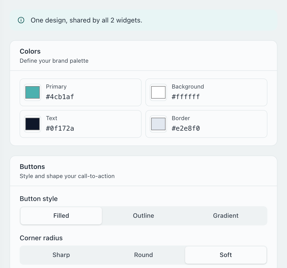
No. There is one design for the whole workspace, used by every widget, your booking page and your website. Each widget can still show or hide the logo.
Still have questions? Contact support